I’ve resisted the temptation to blog about the big issues pro-and-con raised by Donald Trump’s Menie Links golf course in Aberdeenshire. Others have done it bigger (which is appropriate for a larger-than-life character like The Donald) and better than I can.
I did have a pop a while ago at Trump’s environmental concerns about an offshore wind farm that, if it’s ever built, just might be visible (with binoculars) from the higher points of his golf course.
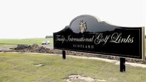
 Now I see he’s in trouble with the local council planners over the sign you see here (I’ve taken it from the Aberdeen Evening Express web site without asking, naughty boy that I am. I’ll remove it if they object, and trek out to take one of my own if necessary – I hope for his sake he’s not using G4S for his security staff these days).
The sign is instructive for a number of reasons.
First, although he was given planning permission for a sign 3.27 metres long it’s actually 6 metres in length. But what’s an 83% disparity between friends? After all it’s only as if The Shard in London was 132 habitable floors high instead of 72.
Then there’s the question of the design, which presumably conforms to some corporate house style knocked up in Manhattan, or more likely Florida.
It’s in shiny black stuff with gold lettering and trim. Of course it is, that spells ‘class’ doesn’t it?
The material might be granite or it might be that waterproof plastic stuff they line shower cubicles with. Never mind that the North East of Scotland does a nice line in granite of its own, with some wonderful grey and pink stone easily available.
Local material might also have dictated a more genuinely classier shape than the rectangle-with-curly-bits-on-the-top that I lack the technical vocabulary to describe.
The curly bits allow space for a presumably faux coat of arms in gold to be inserted above the legend ‘Trump International Golf Links.’ Again, more class. Perhaps the Lord Lyon King of Arms could confirm whether the design has been registered.
Not being a typographer, I don’t know what the typeface used on the sign is. Like the shape of the sign it’s also curly. If it’s choice was ever brainstormed in some design studio I assume their flip chart would have been full of words like ‘hand-written’, ‘quill’, ‘bygone age’, ‘upscale’ and, oh yes, ‘classy.’
Underneath the name of the course is written the word ‘SCOTLAND’ just in case you thought you were in downtown Buenos Aires or Disney World. It’s in capitals of course so you GET THE POINT.
The whole thing is mounted on two rectangular poles, again shiny black. Other mountings are available, like the vernacular dry stane dykes (dry stone walls) that are traditional in the area and are used to great effect in many local signs.
But maybe Trump’s people think a vernacular is some kind of railway you build up the side of a world heritage mountain, improving it no end of course.
I could have taken Mr T to several undertakers in the area that have very similar signs, and to the same effect.
PS Glancing at the photo I’ve just realised that superficially the sign looks like a grand piano dumped down in the middle of nowhere. Seems appropriate.
Leave a comment